Building a responsive navbar with TailwindCSS
Navigation is the most important feature on your website. In this article, you'll learn the basics of making a bullet proof navbar.

Front-end developer | React (Next.js)
Only want the code? Here is a codepen with all you need.
What's a navbar?
Navigation on a website or a web application comes in a lot of forms. The most relevant one is the navbar, the first navigation you see, normally fixed at the top of our screens.
This menu is used in the entirety of your website, making it responsive has become a necessity due to high incoming traffic from mobile devices. Let's nail that navbar.
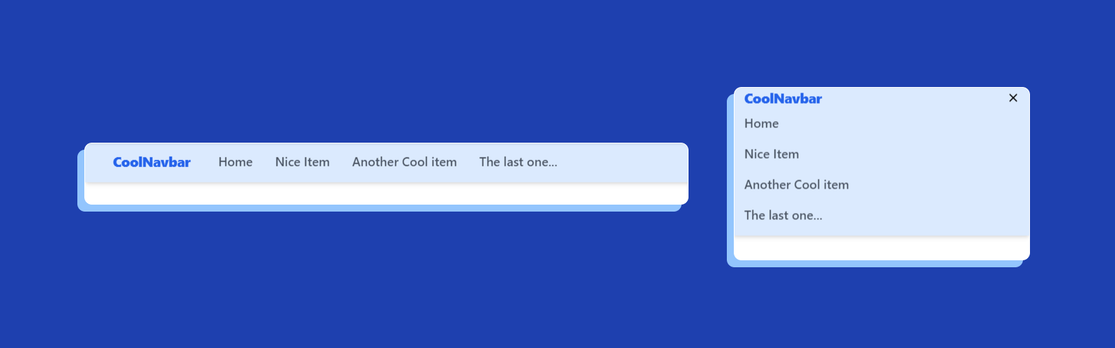
What we'll build on this tutorial looks like this
What we need
I'll be using the playground Tailwind provides, but feel free to follow this tutorial in all your projects with Tailwind already installed.
For the interactive part, we need some JavaScript knowledge on how to toggle the state of our components. It's nothing fancy, don't worry about it too much.
The structure of a navbar
The simpler and prove method of a navbar comes with the following schema:
- A navbar logo
- A list of items or links
- A button to open/close the mobile menu
Pretty simple. The icons are from a open-source library that I used on all my projects, akar-icons. My logo in this case is plain text, you can add whatever you want.
Now — our HTML is going to look like this:
<nav>
  <!-- Our logo and button -->
  <section>
    <!-- Logo -->
    <span>
      CoolNavbar
    </span>

    <!-- Our open/close buttons -->
    <!-- Open menu -->
    <button id="open-menu">
        <svg xmlns="<http://www.w3.org/2000/svg>" width="24" height="24" viewBox="0 0 24 24" fill="none" stroke="currentColor" stroke-width="2" stroke-linecap="round" stroke-linejoin="round" display="block" id="TextAlignJustified"><path d="M3 6h18M3 12h18M3 18h18" /></svg>
    </button>

    <!-- Close menu -->
    <button id="close-menu">
        <svg xmlns="<http://www.w3.org/2000/svg>" width="14" height="14" viewBox="0 0 24 24" fill="none" stroke="currentColor" stroke-width="3" stroke-linecap="round" stroke-linejoin="round" display="block" id="Cross"><path d="M20 20L4 4m16 0L4 20" /></svg>
    </button>
  </section>

  <!-- Our list of items -->
  <ul>
    <li><a href="/">Home</a></li>
    <li><a href="/">Nice Item</a></li>
    <li><a href="/">Another Cool item</a></li>
    <li><a href="/">The last one...</a></li>
  </ul>
</nav>
Something that's good to clarify, Tailwind has a principle of mobile-first design. Classes with the prefix "lg:" are for styles that only applies at bigger screens (laptops and desktop).
With that on the side, let's begin!
Nav Element
The nav element is the main container of our navbar. It wraps our logo, the items and the close/open button. Make it full width, with a nice background color and flex-col lg:flex-row for our different styles in larger screens. Add some shadow for extra flare.
<nav class="w-screen px-4 lg:px-10 py-2 flex flex-col lg:flex-row lg:items-center fixed bg-blue-100 shadow-md">
  <!-- Omitted -->
</nav>
For large screens, the navbar is going to be only one line. On mobile, all the content is going stack horizontally.
Logo and menu button
If you wondered at the start why I putted the buttons on the same section tag with the logo, it's because I want the button on the same line as my logo on mobile devices. Having them on the same container is easier to style. You only need to hide it in larger screens, we are not going to use it anyways.
<section class="w-full lg:w-max flex justify-between">
  <!-- Logo -->
  <span class="font-black tracking-tight text-xl text-blue-600">
    CoolNavbar
  </span>

  <!-- Our open/close buttons -->
  <!-- Open menu -->
  <button class="lg:hidden" id="open-menu">
    <svg xmlns="<http://www.w3.org/2000/svg>" width="24" height="24" viewBox="0 0 24 24" fill="none" stroke="currentColor" stroke-width="2" stroke-linecap="round" stroke-linejoin="round" display="block" id="TextAlignJustified"><path d="M3 6h18M3 12h18M3 18h18" /></svg>
  </button>

  <!-- Close menu -->
  <button class="hidden" id="close-menu">
    <svg xmlns="<http://www.w3.org/2000/svg>" width="14" height="14" viewBox="0 0 24 24" fill="none" stroke="currentColor" stroke-width="3" stroke-linecap="round" stroke-linejoin="round" display="block" id="Cross"><path d="M20 20L4 4m16 0L4 20" /></svg>
  </button>
</section>
The parent container of this section is a flex container in large screens, we add lg:w-max on the logo for taking only the space it needs. We hide the open button in large screens and the close button is hidden by default.
The navbar links
I decided to only add a color change on hover, since this is not a "how to make the most complex navbar with Tailwind". Feel free to add any styles you want to your links and items. You could even add buttons for login/signup or other relevant items like search bars.
Flex-col lg:flex-row follows the same pattern of vertical on mobile — horizontal in desktop.
<ul class="w-full flex flex-col lg:flex-row lg:pl-6">
    <li class="py-2"><a class="text-lg font-medium  lg:px-4 text-gray-600 hover:text-blue-500" href="/">Home</a></li>
    <li class="py-2"><a class="text-lg font-medium lg:px-4 text-gray-600 hover:text-blue-500" href="/">Nice Item</a></li>
    <li class="py-2"><a class="text-lg font-medium lg:px-4 text-gray-600 hover:text-blue-500" href="/">Another Cool item</a></li>
    <li class="py-2"><a class="text-lg font-medium lg:px-4 text-gray-600 hover:text-blue-500" href="/">The last one...</a></li>
</ul>
JavaScript Time
As you saw, making the navbar itself wasn't really difficult. Of course, I encourage you to make your own version — this is just a little demo.
Our JavaScript is going to be really easy, too, so don't worry about it. We need to toggle between open and close menu on mobile. For this, we'll use Tailwind classes as well.
const openMenu = document.getElementById("open-menu");
const closeMenu = document.getElementById("close-menu");
const menuItems = document.getElementById("menu-items");

openMenu.addEventListener("click", (event) => {
  event.preventDefault();
  openMenu.classList.add("hidden");
  closeMenu.classList.remove("hidden");
  menuItems.classList.remove("hidden");
});

closeMenu.addEventListener("click", (event) => {
  event.preventDefault();
  openMenu.classList.remove("hidden");
  closeMenu.classList.add("hidden");
  menuItems.classList.add("hidden");
});
With this simple snippet, we can remove or add the class hidden from our elements. This way, we can show what we want in different states of our application.
Closing thoughts
Here is a screenshot of the final navbar, again! You can take a better look at this codepen.
I hope this tutorial was as clear as possible. If you have any questions and most importantly feedback or suggestion about what should I build and write about, connect with me on my Twitter.


