Add dark mode to your React application with TailwindCSS
People expect dark mode your application. Keep on top of the game with Tailwind and its easy dark mode integration.

Front-end developer | React (Next.js)
Why dark mode?
Most popular applications we use today have a dark mode. It is not a coincidence. Dark mode helps with reading on low-light settings.
Now, I use dark mode in almost all apps that have it. It's easier for me to stare for long periods into a screen with a dark background. Depending on the app, dark mode is a top priority to have.
Lucky for you, if you already have a white/light design, dark mode is not more than inverting the colors. Dark background, light text.
Tailwind has a dark mode built within
If you are using the best CSS framework right now, TailwindCSS, you have almost all the work done. It natively supports dark mode. You only have to add a prefix to the classes for the dark theme.
<div class='text-black dark:text-white'>
    Your nice content that
</div>
For this tutorial, we're implementing dark mode with Tailwind and a React application made in NextJS. Feel free to use your app, or create a quick demo so you can follow along.
I will not cover any styling best practices or have a demo to show. Besides, I'm teaching the pattern of implementing a toggle between a dark and light theme.
With that out of the way, let's get started!
The first thing we want to do is going to our tailwind.config.js file and activate the dark mode option. (Figure 1)
// tailwind.config.js

module.exports = {
  // ...
  darkMode: 'class',
  // ...
};
We activate the 'class' option because we are toggling the theme with a class in our component.
Tailwind also offers a system-preference dark mode utility, add the 'media' option instead of class. If you want to use that, the tutorial ends here. Beware, your users can't change the theme with this approach.
After we activate dark mode on our application is time to create the toggler. In your components folder, create a new component called ThemeProvider.js. Here we store the state of the theme and a button for toggling through light and dark themes. (Figure 2)
// ThemeProvider.js

import React, { useState } from 'react';

export default function ThemeProvider({ children }) {

  const [theme, setTheme] = useState(`light`);

  return (
    <div className={`${theme}`}>
      {children}
    </div>
  );
}
In the tailwind docs, they say:
Now instead of dark:{class} classes being applied based on prefers- color-scheme, they will be applied whenever dark class is present earlier in the HTML tree.
Because we want our theme in the whole application, we need the 'dark' class at the top of the component tree. For this, go to the _app.js file, import our ThemeProvider and wrap the entire page with it. (Figure 3)
// _app.js

import ThemeProvider from '../components/ThemeProvider';

const App = ({ Component, pageProps }) => {
  return (
    <ThemeProvider>
      <Component {...pageProps} />
    </ThemeProvider>
  );
};

export default App;
Almost done, there is one more thing to do. Go back to your ThemeProvider, import the useState hook, and create a state for your theme. By default, I start the app in the light scheme. You can initiate the state as dark if you want.
Now, create a button where the logic will live. Position this button somewhere in the app, and use the onClick method for changing the theme state. (Figure 4)
// ThemeProvider.js

import React, { useState } from 'react';

export default function ThemeProvider({ children }) {
  const [theme, setTheme] = useState(`light`);

  return (
    <div id='theme-wrapper' className={`${theme}`}>
      {children}

      <button
        onClick={() => {
          theme == `light` ? setTheme(`dark`) : setTheme(`light`);
        }}>
        Theme Changer
      </button>
    </div>
  );
}
And just like that, your application supports dark mode. Pretty neat!
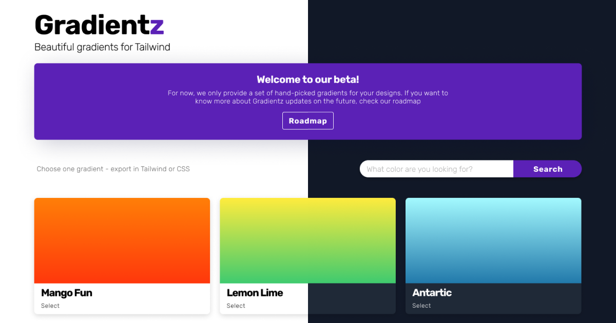
Look at this example of my application, Gradientz, in both light and dark themes. (Figure 5)
Bonus tips: transitions and localStorage
Changing from dark to light and the other way around can hurt the eyes quite a bit, more in larger screens.
A nice thing I add to the app above: for every component that has a 'dark' class, I attached the "transition-colors" class, allowing for a nice transition between themes.
It is not necessary, but it can improve the color change.
The second important tip, create a localStorage instance for saving the preferences of the user. If someone changes the theme to dark, they may not want the light theme again when they come back.
Because we are using NextJS, it doesn't support localStorage calls by default. We need to call it inside a useEffect hook. Go to your ThemeProvider, import useEffect, and add the following code snippet. (Figure 6)
// ThemeProvider.js

import React, { useState, useEffect } from 'react';

export default function ThemeProvider({ children }) {
  const [theme, setTheme] = useState(``);

  useEffect(() => {
    const localStorageTheme = localStorage.getItem('theme');
    if (localStorageTheme) {
      setTheme(localStorageTheme);
    } else {
      localStorage.setItem('theme', `light`);
      setTheme(`light`);
    }
  }, []);

  useEffect(() => {
    localStorage.setItem('theme', theme);
  }, [theme]);

  return (
    <div id='theme-wrapper' className={`${theme} theme-changer`}>
      {children}

      <button
        onClick={() => {
          theme == `light` ? setTheme(`dark`) : setTheme(`light`);
        }}>
        Theme Changer
      </button>
    </div>
  );
}
The first time our app renders, it will check for the localStorage value and set it. The second useEffect will change the value in our localStorage every time the theme is changed.
Congratulations, you add dark mode to your app.
If you've been following the tutorial, you now have an app with dark mode. Remember, every modern app has a dark mode functionality. So the next time you create a new one, add this at the top of the features list.
Thanks for reading, and I see you the next time!


